Course Template
I have been thinking about the design and the different elements that I wanted to incorporate into the page. So after finishing the first unit last week, this step could not be put off any more. I had an issue trying to get training to design using Dreamweaver.
I don't have much experience building web sites and the only program that I had worked with was frontpage. Since everyone said that Dreamweaver was a better program, I decided to use that to design this. For a while, I thought I was going to have to revert back to Frontpage. Another goals was to learn how to implement CSS to the site so that future work on it was easier.
I was not able to be the training which I was hoping to get since no one at my institution who is involved with faculty development is trained in using this program. We have digital design faculty but they are too busy with classes and what I wanted to do was a bit complex for a one hour sit down session. I was able to discuss some of my design ideas with JJ Vavra who walked me through a 10 minute explanation of what the simplest way to design for my specific requirements was. I played with the program for a couple of weeks but was not satisfied with much of what I had done.
My next step was to search for sites which had components which I wanted to use. I also looked at what templates Dreamweaver had available that I could use as a starting point. I decided to dive into a CSS based template which had the CSS elements I wanted to incorporate and I also used a one page template which had some design elments that I wanted to use. I then set out to design a page to my specifications using the code in the templates as my guide.
My main goals were:
- Have clear navigation
- Present an at a glace look of the content of the page
- Format to include as much pertinent information on one page
- Minimize scrolling
- Personalize the page
- High contrast color scheme
- Visibly appealing color scheme
- CSS design
1. I wasn't sure exactly where I wanted to have my navigation bars especially since I had to think about how my design would fit into the design of WebCt Vista. Right now I still haven't decided if I'm going to host the course in my own site or if I'm going to load my pages onto Vista. I decided to go ahead and design it independently of Vista (which is good for me because of the portability of the site) and then make the Vista decision at a later point after I had had more time to play with Vista and its tools.
Vista has an entry page which opens to a set of tools chosen by the designer. I still have to ask if it is possible to go directly onto a linked page upon entry rather than going to that Main page. To me that Main page will really be an intermediary between Vista and my pages. So my goal for minimizing clicks automatically got more difficult. Vista has a content module tool which sets up frames with the linked page on the main frame to the right and a table of contents frame on the left. The way I think the course will be designed will be: enter Main Vista page with links to Content/Unit modules. The Content module will have
- my Dreamweaver designed Unit page--that page will then link to other content inside my site
- WebCt discussion link
- WebCt assignment link
- Other collaboration tools
I could have just used the content module to design the different pages for my units but then the units would be organized in a linear fashion and would not meet the different goals that I wanted. I have seen several online courses and they are just a list of things the students need to do; some do demonstrate that some thought went into the design of the page but the pages are still mostly text with very little "personality" in the design. I did find several in which I could "read" the personality of the instructor by the way in which he addressed the students in his pages. But that still was mainly communicating via the text. I found a couple and have heard of a couple of instructors who demonstrated their personality via the design but mostly in ways that was not of value to the instruction. I heard of one who used different flowers for icons, a flower lover I guess, and another who used hot pink for all her headings. These choices certainly reveal personality and that may have an important affective component but I don't think those choices had anything to do with the instructional goals.
2. One of my main objectives--this is what one of the UDL sessions recommended--was that assignments be designed in a way that all important information is clearly visible to the students. I really liked the design which Robbin Zeff used but I wanted to accomplish a bit more with it. Here is a link to her design http://www.zeff.com/cwonline/paper3.htm. I really liked the post-it note idea but when I spoke to a designer they told me that those were images which which part of the page. Well, I didn't want images. I wanted to design a page which I was going to be able to share with others and using images was not very conducive to that. So I decided to keep with the idea of including the information which she suggested in highly visible areas such as due dates but incorporating a design which is more friendly to those who do not have much experience designing web pages.
The information which I wanted clearly visible are: the media links, synopsis of the page, resources links which could change depending on the assignment, contact information, deadlines. I wasn't too sure about scrolling. I knew I wanted to design the page so that it would change depending on screen size so that there would be no horizontal scrolling which was needed. Design experts argue that users do not want to scroll across but they will scroll down indefinitely. I know that most of my unit pages will have alot of text and I want to keep all the information to gether rather than in separate pages. I'm not sure about users scrolling indefinitely so I decided that I would also include links to page sections so that students would not have to scroll but could navigate easily within the page.
5. As to personalizing the page, I have to think about that a bit more. I think adding the video and audio components will personalize the instruction but not so much the page.
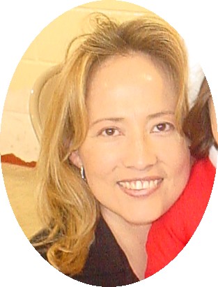
I have been thinking about how important images are for me and for other students in the phd program, f2f interaction is very important. I have not been using the webcam very much and I'm not sure that I want to use that. I have decided that using pictures is a good balance. The feel of the person is there without needing to have the tech tools and fighting the bandwidth battle at school. So I added the image and the Yahoo IM presence tool.
I have one concern about the tool. I would like for it to show the user status. If the page shows that I am online but I am really not available then that may become a problem with students. So I would have to be really careful about logging out when I will be unavailable and not letting the IM idle. I wonder if there is some code to add that component to the page.
6.7. I wish I could say that my choice in color scheme was inspired by blogger but it was not until after I had finished it and that I logged in to write this entry that I realized how similar the color scheme that I chose is. I guess blogger has entered my subconscious without me being aware of it.
posted by Prof Santoy at 9:48 PM
![]()

2 Comments:
If you're looking to 'style' your WebCT Vista Homepage so it looks a little more like the rest of your site, you can add an awful lot into the headers and footers. Just pop into Dreamweaver, grab a copy of the HTML, plop it into the headers/footers, and then modify as necessary. You can even embed CSS in the headers and footers, overriding the styles defined by default in WebCT.
Your design skills seem to be very good. The design of your presentation in 5364 was very strong. Sure, takes tons of time, but you're doing just fine. The CSS zenGarden site is something worth looking at if you haven't already. Yahoo has code to embed a button in HTML that says if you're online or not. See http://richrice.com/reached.htm for instance. Might be useful.
Post a Comment
<< Home